
Be Brighter!
This must be the greyest, most miserable time of the year so making our home feel like a sanctuary can really help to boost our spirits.
In her guest blog, our friend and freelance writer Laura Moore, explains the role colour can play in helping to both relax and revive us.
Be Brighter – Pantone’s Colour of the Year – Laura Moore
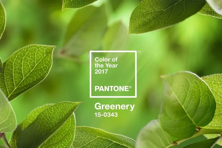
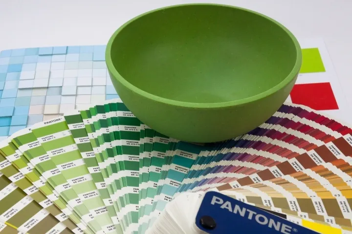
Pantone have revealed their Colour of the Year for 2017 – Greenery. Described as ‘nature’s neutral’, the green-yellow hue provides a calming escape from the digital world. The shade chosen by
Pantone each year has a strong influence on the year’s trends in design, so here’s how to bring the outside in.
Plants
‘This is the color of hopefulness, and of our connection to nature,’ Leatrice Eiseman, executive director of the Pantone Color Institute, told The New York Times.
So naturally, the best way to introduce Greenery to your home is through foliage. Succulents are still wildly popular potted plants, and low maintenance too. If you have a larger space to fill, try an equally easy ficus. Their shiny green leaves will breathe life into any room.
The Kitchen
Why not try bringing this gorgeous green into your kitchen to create a revitalising environment? It would look great on a feature wall or even to upcycle old cabinets or furniture.
Stick to your ‘New Year, New You’ plan and keep your food as fresh as this shade with green tea, crunchy salads and home-grown herbs.
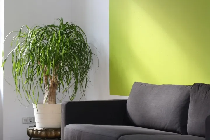
Home Accessories
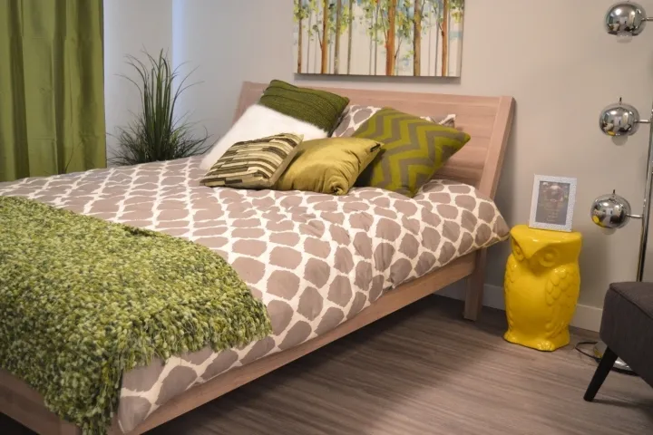
As an accent colour, Greenery works beautifully with cool, crisp white as well as warmer creams, adding a zippy energy. Try it for soft furnishings, rugs, cushions and throws, to lift your living room or boost a bedroom.
Greenery is a spring time shade for new beginnings, synonymous with the new year; a fresh colour for a fresh start.